
Design System
DefinedCrowd
MY ROLE
Designer
Heading 3
.png)
About this Project
In September 2020, I was invited to the amazing mission of being the Responsible Designer for the consolidation and creation of the Design System at Defined Crowd. I would join the design ops team as the Design System lead. This project had a deadline of 6 months to complete the design system.
Goals
Our primary goal with the design system was to create consistency, efficiency, and scalability in digital product design and development. Through a set of guidelines, reusable components, and principles, we aimed to align multidisciplinary teams and ensure a cohesive user experience across all touchpoints. The first step was to create a strategy with the Design Ops team that consisted of 6 steps.
1. Component inventory
2. Roadmap creation
3. Switch from Sketch to Figma
Principles
Efficiency
Identifying difficulties and needs that users
Accessible
Identifying improvements for the new homepage
Consistency
Delivers greater value and a better user experience
Aligned
Doing more with quality in less time, equals saving time and money
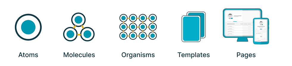
Based on Atomic Design
The design system was developed based on best practices from the design community, tailored to our specific needs. An example of this is our structure, inspired by the concept of Atomic Design.
Foundations

Colors
Colors can be considered part of the Brand. Properties that reinforce the appearance, feeling, and order of the experience we are designing. There are segmented into five subcategories: Standard, Grays, Semantic, Social Logins, and Tags. All colors have been validated for accessibility in the application.

Typography
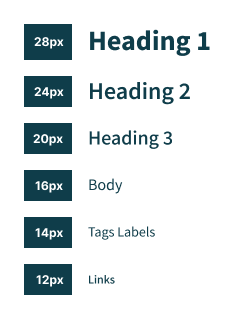
Typography is pivotal in design systems, shaping product identity and user experience. We've chosen Mada for its versatility and aesthetic appeal. Mada offers diverse styles and weights, ensuring a cohesive hierarchy. Our scale provides attention-grabbing headlines and structured content. With a scaling factor of 1.2, our system maintains consistency, enhancing brand identity and user experience.

Grid
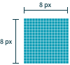
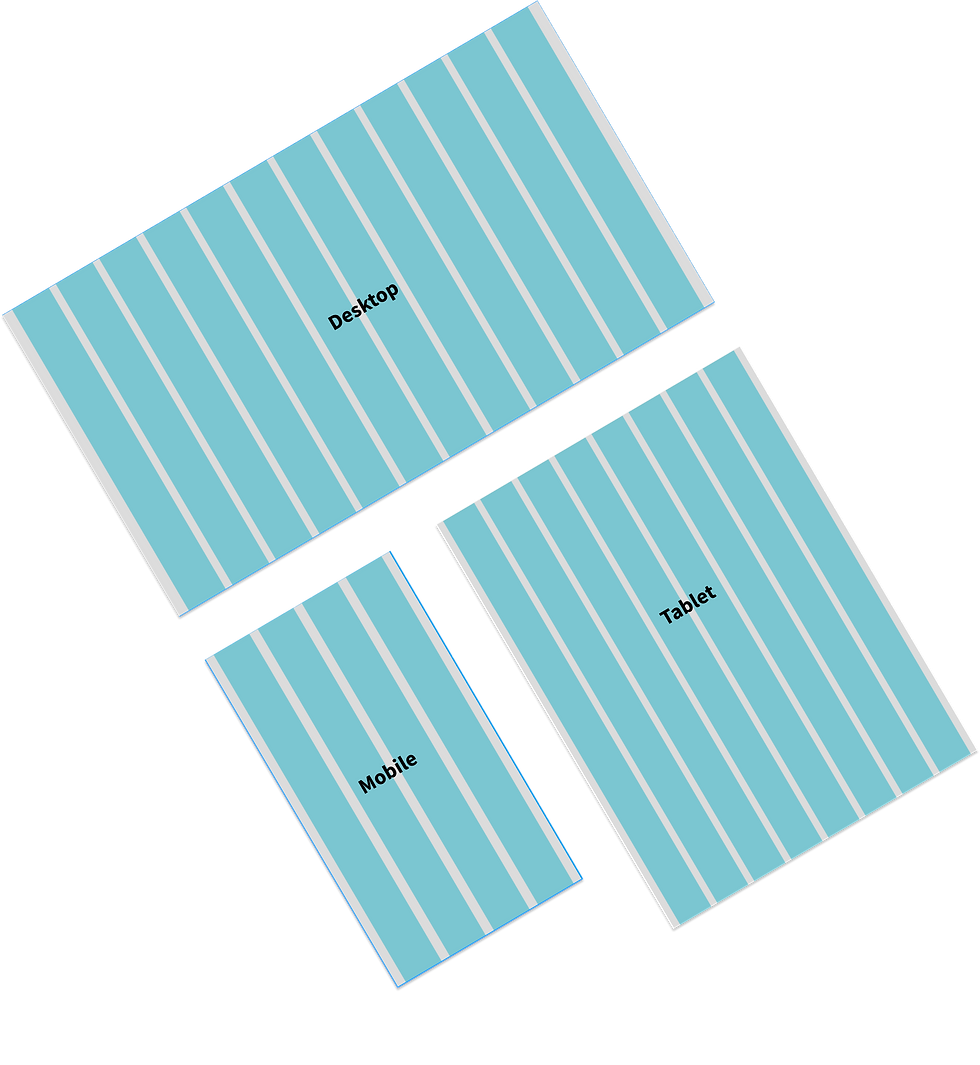
I chose to use an 8-point grid due to its versatility and ability to create balanced and visually pleasing layouts. With divisions in multiples of 8, we have a flexible structure that facilitates the organization and alignment of elements in the interface, allowing for cohesive and efficient design. Additionally, the 8-point grid provides greater visual consistency and facilitates design maintenance across different devices and screen sizes.
Assets
Icon
In the design system, we offer two icon options: line or full. The minimum recommended size for use is 24px. Icons have been designed within a 12px x 12px area, with the diagonal being the only exception that exceeds this size.

Ilustrations
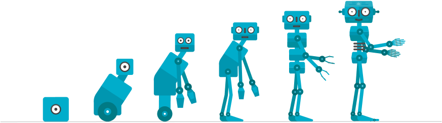
The Design System features over 50 illustrations created for specific scenarios on the platform, ranging from Neevo expressions to anatomy and evolution.

4. Creation of new components
5. Design system documentation
6. Handoff of the design system
Process
The first step was to create a strategy with the Design Ops team that consisted of 6 steps.
Documentation & Tools Used
For the Design System documentation, we used Zeroheight as the main platform. It serves as a centralized hub for all brand guidelines, visual principles, usage rules, and component use cases — making it easier for design, product, and marketing teams to access, reference, and adopt.
On the development side, the front-end team used Storybook to document and test components in isolation. This ensures each component meets the visual and behavioral specifications defined in the Design System, while also supporting scalability and maintainability.
The integration between Zeroheight and Storybook offers a complete view — both conceptual and practical — of the design system, fostering consistency, efficiency, and collaboration across teams.
Outcomes
With the implementation of the Design System, we observed near-complete adoption by both design and front-end teams, in a quick and natural way. This adoption led to a significant reduction in interface design time and front-end development time. Additionally, there was a noticeable decrease in visual bugs and inconsistencies across applications. As a result, we were able to increase the speed of new feature releases, improving product scalability with less effort and greater efficiency.